New Wave Post-Modern
[ Styles from [1980-1989] Part 1
The new generation of young designers who appeared in 1980s found that the modernist developments of the post-war decades now seemed largely antiquated.
In their search for fresh approaches for design, they rebelled in a variety of ways against the basic notion that graphics must be spare and sober.
/ Technological Innovations /
Desktop Publishing Rapid Rise
1984 Apple Macintosh
first graphic oriented computer
Page Maker
first software to enable people to design and set up a whole magazine.
/ Adobe Corporation /
Is founded by John Warnock.
Creating programs for processing
graphics and photos immediately changing the
entire face of the creative industry.
/ Hewlett-Packard /
Introduces the first commercial desktop laser printer

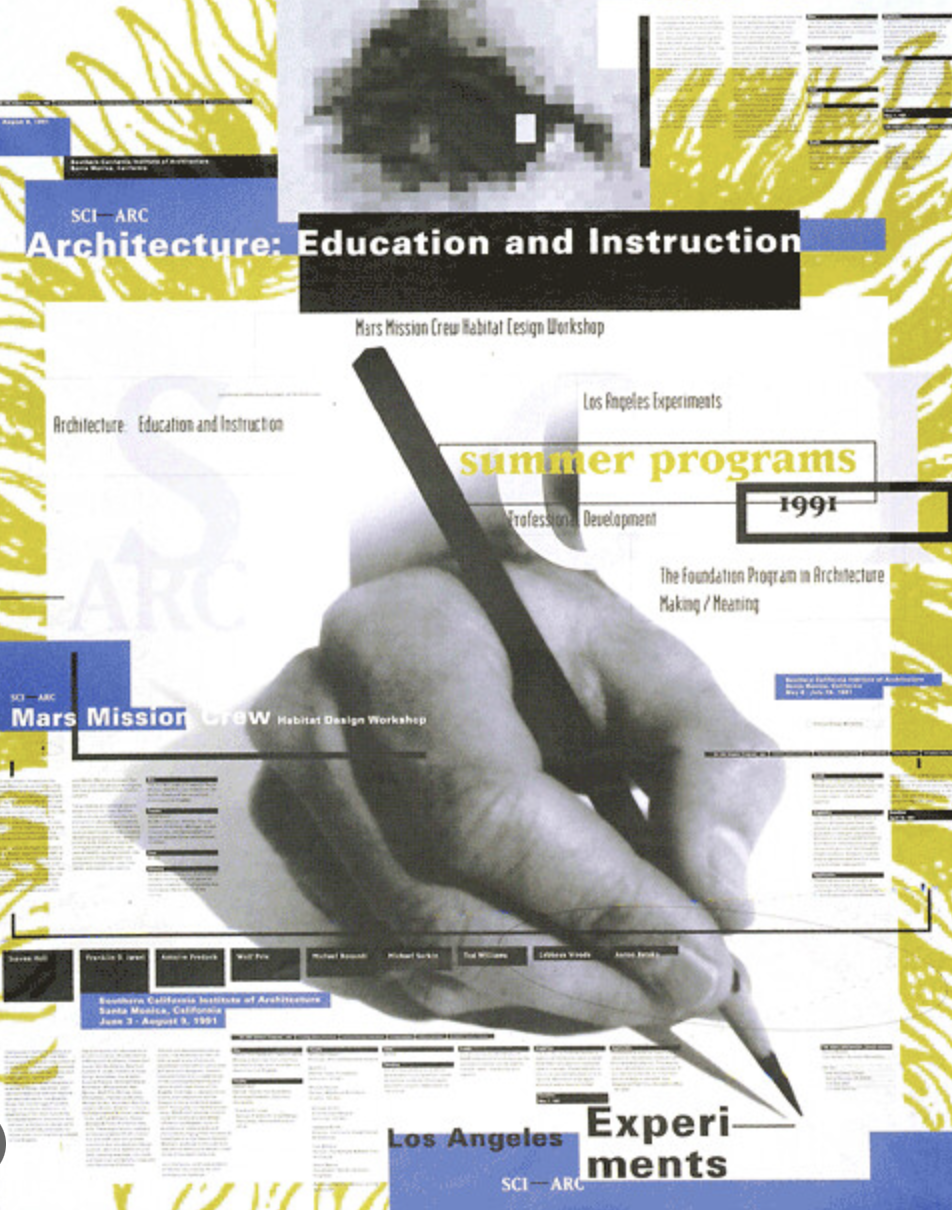
April Greiman
Graphic Designer
[ 1948-Now]
Born in New York
April Greiman is an American designer widely recognized as one of the first designers to embrace computer technology as a design tool. Greiman is also credited, along with early collaborator Jayme Odgers, with helping to import the European New Wave design style to the US during the late 70s and early 80s.
Greiman finds the title graphic designer too limiting and prefers to call herself a "transmedia artist". Her work has inspired designers to develop the computer as a tool of design and to be curious and exploratory in their design approach. Her process includes typelayering, where words and letters are sandwiched and layered, but also appear to float along with other 'objects in space' such as: color swatches, illustrations, lines, mapping, photographs, shapes, among other visual assets. She creates a sense of depth and dynamism, in particular, by combining graphic elements through making extensive use of Apple Macintosh technology.


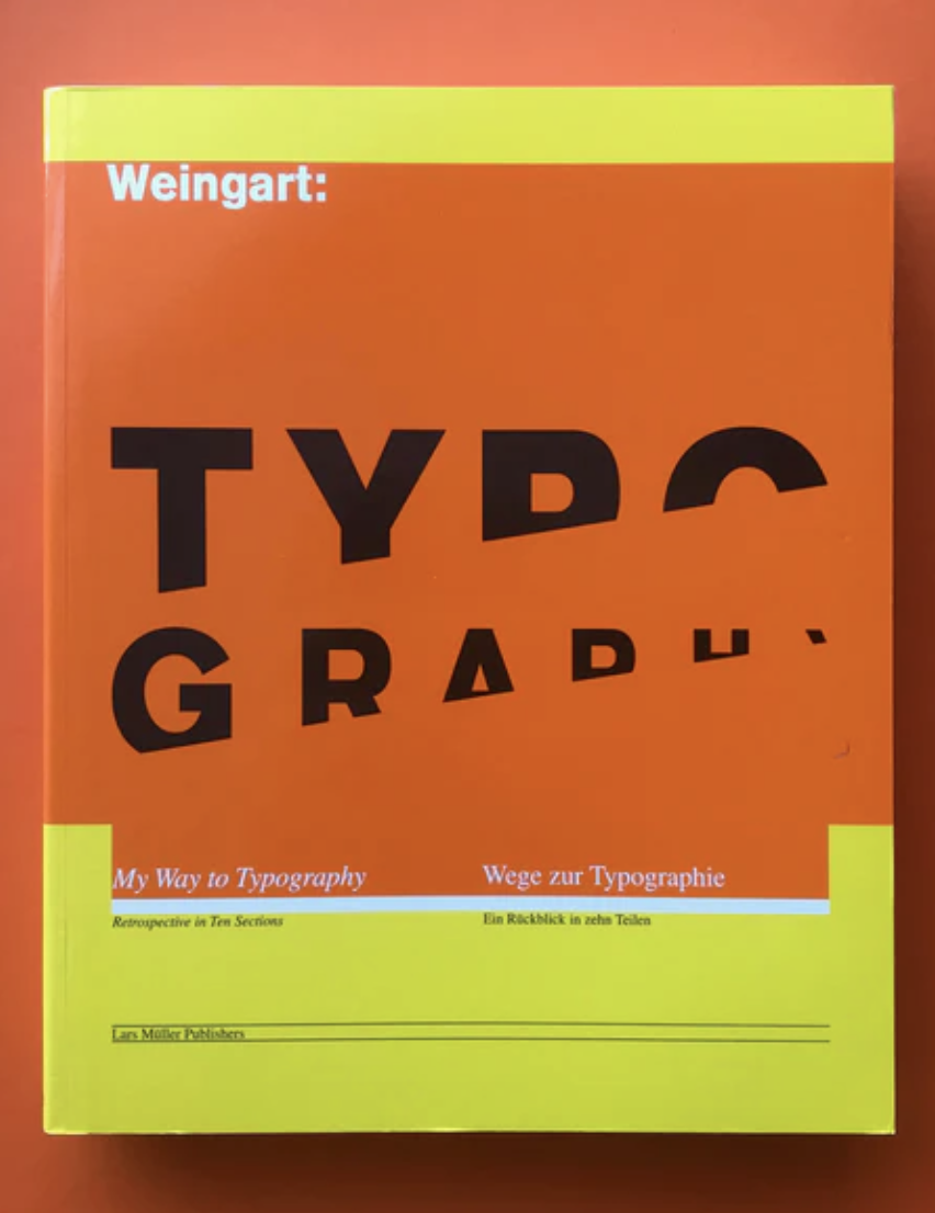
Wolfgang Weingart
Graphic Designer
[ 1941-2021]
Born in Germany
Wolfgang Weingart was an internationally known graphic designer and typographer. His work was categorized as Swiss typography and he was credited as "the father" of New Wave or Swiss Punk typography.
He is known for:
-He did typesetting and the process of making linocuts and woodcuts.
-After this he trained as a typesetter and discovered Swiss typography.
-He influenced the international development of typography.
-Countless designers have been inspired by his teaching and by his lectures.
-He has received several awards for his lifework:
-Awarded an honorary doctorate in fine arts by Massachusetts college of arts.
-In 2013 the aiga medal in Boston.


More posters by
Wolfgang Weingart

Peter Saville
Art Director & Graphic Designer
[ 1955 ]
Born in Manchester
An English art director and graphic designer. He designed many record sleeves for Factory Records.
Factory Records was a Manchester-based British independent record label founded in 1978 by Tony Wilson and Alan Erasmus.


